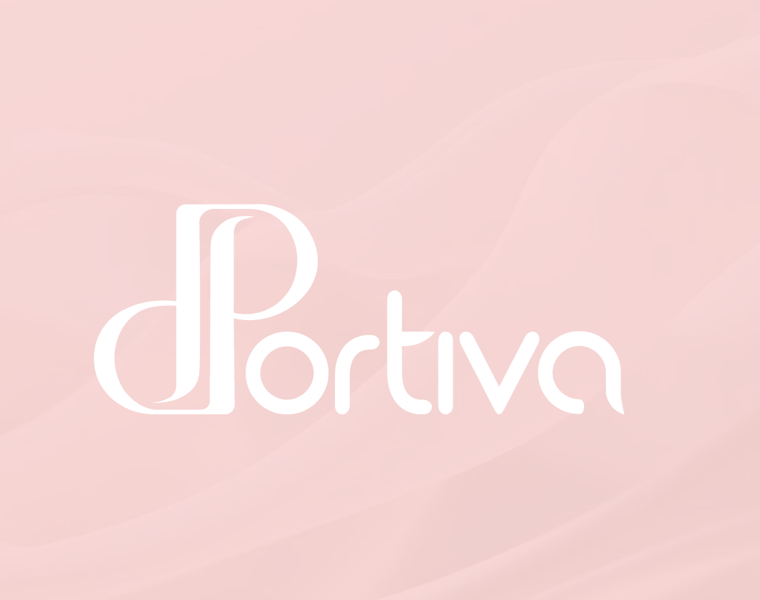
For the brand Portiva from the United Arab Emirates, which specializes in producing and selling notebooks and stationery items, the beBold team created the complete visual identity.
What was done:
Logo design – typographic, hand-drawn, in a pastel palette
Selection and definition of typography and color palette
Design of icons, badges, print materials, and stickers
Development of Instagram templates for a consistent and elegant visual presence on social media
Creation of the full brand identity, tailored to a female target audience
Pastel colors, soft lines, and hand-crafted typography reflect subtlety, creativity, and a feminine aesthetic – exactly what Portiva represents.
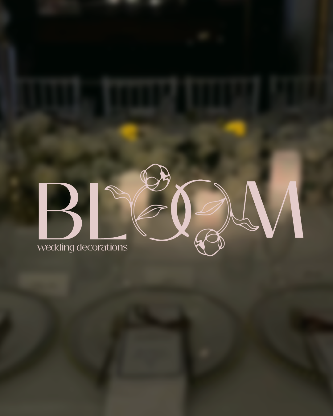
Project: Visual Identity Redesign for Bloom Wedding Decorations
Service: Logo design/redesign + development of a visual system (badge variations)
Goal: To improve the existing logo and create a modern, elegant, and symbolic visual identity that better communicates the brand’s values and appeals to the target audience.
Key Activities:
Logo Redesign: New typography, improved readability, and an aesthetic balance between classic and modern styles.
Symbolism: The letters “O” represent wedding rings — a symbol of marriage and connection.
Secondary Variations (Badges): Circular logo versions for use on labels, packaging, and digital channels.
Color Palette: Subtle, natural tones that match the brand’s sensibility and target audience.
Result:
An elegant and recognizable visual system that gives the brand a more professional and emotionally stronger identity.
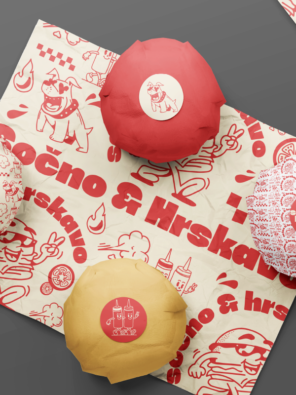
Within the project, we created:
A logo inspired by the texture, shape, and layers of a burger
A color palette and typography designed to stimulate appetite
Packaging (wrappers, boxes, cups, napkins)
Stickers and a sticker pack for packaging and social media
Animated characters – “burger buddies” as brand ambassadors
A tone of voice and a mini brand guide for consistent brand representation across all channels
The result is a brand that communicates not just flavor, but attitude.
Fun, playful, and visually delicious — just like their menu.
For Sočno & Hrskavo, a local burger brand that combines local taste and urban spirit, we did the entire branding - from the idea to the packaging. Our approach was strategic and bold: to make the brand recognizable beyond taste - through colors, shapes, characters and tone of communication. As part of the project, we created: A logo inspired by the texture, shape and layers of a burger Color palette and typography that arouses the appetite. Packaging (wraps, boxes, glasses, napkins). Stickers and sticker-packs for packaging and social networks. Animated characters - "burger buddies" as brand ambassadors. Tone of communication and mini brand guide for consistent brand presentation on all channels. The result is a brand that communicates not only taste, but also attitude. Fun, playful and visually delicious – just like their menu.
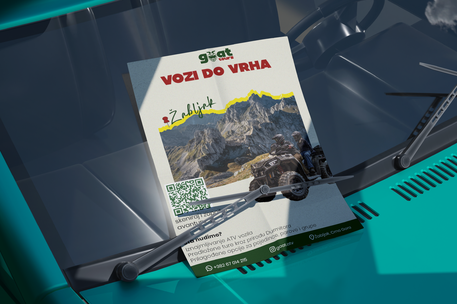
We created a complete visual identity for GOAT ATV - from logo design, ATV equipment branding, to promotional press materials. We also created the design of business cards, flyers, brochures and posters that follow the spirit of the brand and provide a clear, striking presentation of services. The brand is now consistent in every detail - both on the field and on paper.
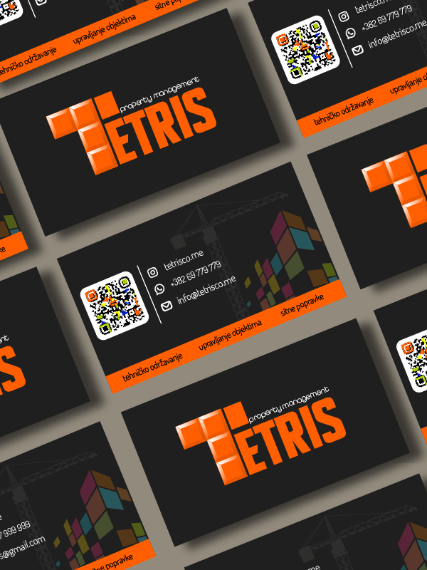
For Tetris, a real estate management brand, we developed a visual identity and complete promotion. We started with defining the brand through logo design and choosing a visual direction that communicates professionalism, clarity and trust. This was followed by the creation of promotional materials for the press - flyers, brochures and business materials that accompany the brand in everyday communication. Special focus was on managing social networks - we designed posts, created a communication tone and created content that clearly represents the services and values that Tetris offers. In addition, we also organized professional photography of the space and real estate, with the aim of making the visual presentation in line with the brand's high standards.
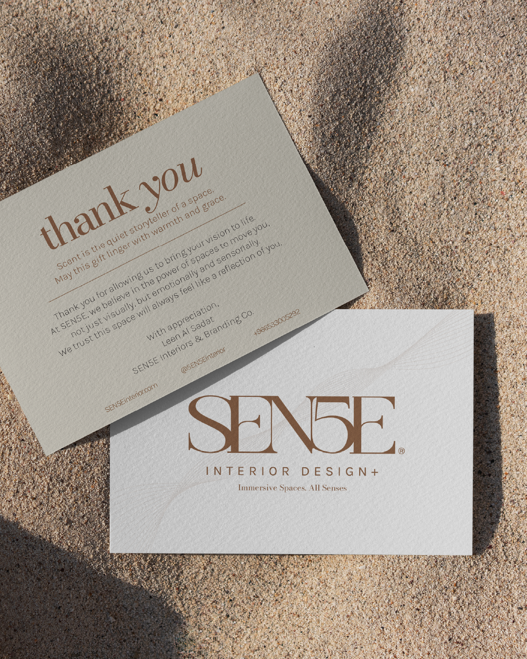
Project: Thank You Card Design for SEN5E Interior Design
Client: SEN5E Interior Design
Location: Saudi Arabia
Industry: Interior Design
Goal:
To design an elegant and luxurious thank you card that is sent to clients after completed projects, aiming to leave a strong impression and strengthen the brand.
Design Approach:
Aesthetics: Minimalism with an emphasis on sophistication and a sense of luxury, aligned with the interior design aesthetics SEN5E is known for.
Typography: A combination of modern handwritten fonts that convey trust and professionalism.
Colors: Earthy and neutral tones (beige, gold, gray) were used to reflect the brand’s style, the harmony of interiors, and the company’s location.
Details: A subtle SEN5E logo in gold foil or print, a simple thank-you message, and minimal contact information.
Result:
A thank you card that not only expresses gratitude but also further communicates attention to detail, aesthetics, and clients — the values for which SEN5E is recognized.
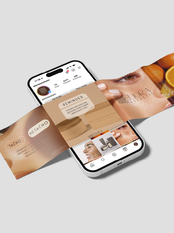
For Eliora Aesthetics, a brand dedicated to skin care through carefully selected ingredients and aesthetic balance, we created a complete brand identity - sophisticated, clean and timeless, as well as the design of packaging and packaging of products that are elegant, minimalist and exclusive. The goal was to harmonize every visual element with the brand's philosophy: minimalism and natural beauty. Every color, line and typographic detail has been carefully chosen to communicate confidence, tenderness and luxury.
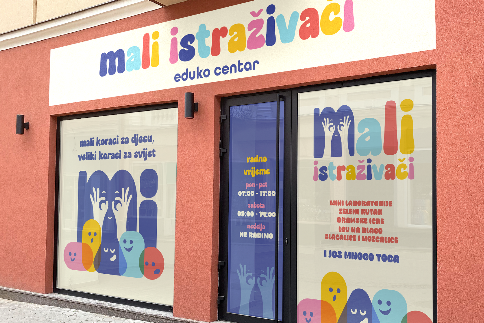
For Male Istraživače, a center for early development and education of children, we designed a complete visual identity that speaks the language of play, knowledge and gentle authority. Our task was to create a world where both child and parent feel safe, motivated and inspired. Through colors, forms and tone of communication — we visually conveyed the values of curiosity, knowledge and warmth. In addition to the complete branding, which includes the creation of logos, animations, stickers and personalized content for social networks, a conceptual design of the building's window display was also created.
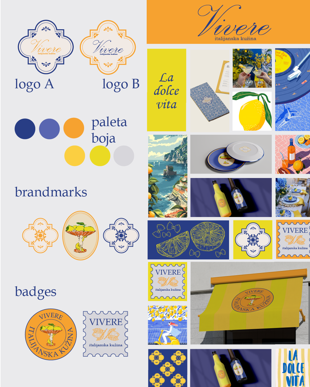
Za Vivere, italijanski mediteranski restoran, razvili smo kompletan vizuelni identitet koji odražava duh mediteranskog življenja — eleganciju, toplinu i autentičnost.
Započeli smo definisanjem brend strategije kroz pažljivo oblikovanje logotipa i vizuelnog jezika koji povezuje simboliku mora i sunca — plavu i žutu. Cilj je bio kreirati prepoznatljivo i emotivno iskustvo koje goste uvodi u svijet Vivere već pri prvom kontaktu s brendom.
U nastavku smo dizajnirali kompletan set brend elemenata:
Varijacije logotipa
Paletu boja i tipografiju
Dizajn tanjira, boca i ambalaže
Spoljnu signalizaciju i fasadu restorana
Menije, bedževe za osoblje i propratne brend elemente
Svaki detalj bio je pažljivo kreiran kako bi prenio Vivere-ovu suštinu — sofisticiranost, dobrodošlicu i jedinstven mediteranski karakter.